New Extreme Violet – A Tribute to a Potential Colour
By Catherine de Smet
In 2009 the Pompidou Centre in Paris launched a temporary, multidisciplinary event open to the most contemporary forms of creativity. It was designed to become an annual event, the Nouveau Festival. For its fourth incarnation, in 2013, this ‘new festival’ considered adopting its own visual identity. To that end the festival organisers, led by director Bernard Blistène, sounded out the Zak Group design agency, in the hope of including graphic design in the festival programme. Commissioning a visual identity seemed like a natural way to invite graphic designers to participate without undermining their normal business practices. The plan ran aground at a fairly early stage, even before there arose the issue of compatibility between a specific identity and the Pompidou Centre’s own corporate image, which is supposed to apply to all its activities regardless of the department in charge of them. Aware of that problem, Zak Group had anticipated objections by devising an identity based on a single feature, one that was highly specific yet perfectly adaptable – a colour. Like the colours associated with heraldry, however, this colour would not be defined so much by a particular chromatic quality as by a name: ‘New Extreme Violet’. The traditional vocabulary of heraldic coats of arms – the forebears of today’s logos – makes it possible to indicate the colours they employ in an abstract way: ‘azure’ may translate into all kinds of blue, ‘gules’ may give rise to a varied range of reds, and ‘vert’ to different greens. So New Extreme Violet did not correspond to any specific point on a colour chart (unlike ‘extreme violet’, sometimes called ‘vivid violet’), and it will remain an imaginary colour (unless Zak Group decides to give it a more concrete existence). Thus its only material existence will have been the Group’s presentation of its proposal.
That twenty-page proposal was submitted to the Nouveau Festival team in September 2012. It explained the background behind the idea, along with applications in terms of a modular system of signage based on pipes and panels, whose design would be handled by Jezko Fezer, an architect with whom Zak Kyes had already worked. By way of introduction, it offered a brief visual reminder of the Pompidou Centre’s colourful history, starting with the publicity material and signs that have organised the Centre’s image around a palette of bright colours ever since its 1977 inauguration, then focusing on the skein of colourful girders and pipes composing the building by architects Renzo Piano and Richard Rogers, which had already inspired the multi-hued approach of graphic designers right from the outset. Jean Widmer and Ernst Hiestand, winners of the competition for design of the Centre’s first visual identity in 1974, had even wanted to rely solely on a specific typeface associated with a colour code – a distinct hue for each department (red for the museum, blue for the Centre de Création Industrielle (CCI), green for the library, purplish red for the Institut de Recherche Acoustique et Musicale (IRCAM), and yellow for the administration and transversal activities). Reflecting the design world’s reservations about the growing power of corporate branding, Widmer and Hiestand thus defended the principle of creating an image without a logo. [1]
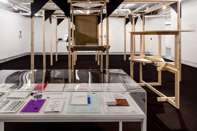
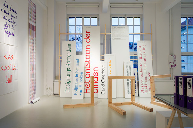
The allusion to the architectural design of the building had lent impact to Widmer and Hiestand’s proposal, including the logo reluctantly produced by Widmer in the face of pressing demands by the Centre’s management at the end of 1976, shortly before it opened: five horizontal bars, one for each floor, were traversed by a diagonal zigzag embodying the famous escalator, thereby conveying the structure of the building. Zak Group revived, in a different fashion, this recourse to graphic decisions based on the physical building. Kyes’s role as art director of the Architectural Association School in London since 2006, where along with Wayne Daly he founded the Bedford Press – whose catalogue features publications on graphic design and architecture – was probably not coincidental to the thinking behind this approach. It is worth noting that Kyes curated an exhibition titled Forms of Inquiry: The Architecture of Critical Graphic Design, which invited a number of graphic designers to explain their connection to architecture, envisaged simultaneously as a field of activity and a tool of reflection. [2]
The idea of using a colour as an identifying mark for the Nouveau Festival arose from observation of the code devised by Piano and Rogers: blue for everything related to the supply and recycling of air; green for water pipes; yellow for electrical facilities; and red for features enabling people to move around the building. Thus by adding New Extreme Violet for the Nouveau Festival, Zak Group’s proposal was effectively comparing it to one of the Centre’s basic elements – the supply of experimental programming. A diagram furthermore suggested that New Extreme Violet resulted from a combination of all the colours chosen by Widmer and Hiestand for the Centre’s original visual scheme. One of them, the purplish red identifying IRCAM, merits a historical footnote: it was originally a violet that IRCAM’s director, Pierre Boulez, rejected due to its ‘twilight’ quality, as he allegedly explained to Widmer. The conciliatory designer therefore altered, if not the hue itself, at least its name. So violet became the purplish red, or scarlet, known as pourpre in French, leaving the door open to a new – extreme – violet some thirty-seven years later.

Boulez’s reaction seems to have been prompted by a practice deeply rooted in western history. Violet is associated with penitence and mourning (as is black, which can be replaced by violet); according to Catholic liturgy, violet vestments are appropriate for masses for the dead, for the feast of the Holy Innocents, and for the periods of Advent and Lent. That is what Cardinal Lothar of Segni indicated in his late twelfth-century treatise on the mass, designed to extend the Roman rite to all Christendom. [3] It should be noted that Widmer’s chromatic modification did not abandon the religious register, if we consider that ‘scarlet’ (pourpre) is identified with the garments and attributes of cardinals of the church. An allusion to the great responsibilities of those high church officials perhaps seemed less distasteful than a reminder of a mass for the dead – assuming we overlook the fact that red was supposed to evoke the blood of Christ.
But purple-violet may also evoke the rock music of Deep Purple, or superstar Ultra Violet (the name chosen by Isabelle Colin Dufresne from Grenoble, France, when she joined Andy Warhol’s Factory), or even the ‘little violets’ that were neither flowers nor artichokes but the doses of LSD that were discreetly being sold in my lycée in Paris in the mid 1970s. Then there was the research carried out by Charles Féré in his laboratory in the Bicêtre asylum outside Paris in the late nineteenth century, studying the effect of colour on muscular activity, and applying his conclusions to the treatment of mental illness. ‘Violet, which demonstrates a relative depressive effect, has been used with some success, as has blue, in the treatment of manic excitement, among patients who were kept in rooms that received daylight solely through blue or violet windowpanes.’ [4] Féré presented his experiments on patients in eloquent charts in which violet appeared as the least dynamogenic colour in terms of ‘excitation of the senses.’ [5] His conclusions would seem to be refuted by Proust’s orchids, those violet cattleyas dear to the central couple in Swann’s Way, who employed the metaphor of ‘‘do a cattleya’... when they wished to refer to the act of physical possession (in which paradoxically, the possessor possesses nothing).’ [6] Indeed, Vladimir Nabokov stressed the impact of this colour on Proust’s text itself, referring to ‘the violet tint that runs through the whole book, the very colour of time. This rose-purple mauve, a pinkish lilac, a violet flush, is linked in European literature with certain sophistications of the artistic temperament. It is the colour of an orchid, Cattleya labiata (the genus called thus after William Cattley, a solemn British botanist).’ [7]
It is also, more immediately, the colour of violets [8] – the use of similar words to indicate both flower and colour was already employed by the Greeks, who derived the latter from the former. It is therefore impossible to agree fully with Adolf Loos when he asserted, in his famous diatribe against ornamentation, that the eighteenth century apparently ‘discovered’ violet, because ‘before that, violets were blue and the purple snail was red.’ He similarly claimed that children – whose development reputedly recapitulates human history – are not ‘aware of violet’ before the age of eight. ‘There are people who are not modern, people still living in the eighteenth century, horrified at a picture with violet shadows because they have not yet learned to see the colour violet.’ [9]
This implicit allusion to Delacroix [10] probably offers a key to Loos’ strange use of this chromatic detail to strengthen his argument in favour of the banishment of ornament. Violet thereby becomes modern. Perhaps. On the other hand, antiquity was already familiar with violet, and even little schoolchildren know how to recognise it. But if Loos was mistaken on this point, we must agree with his comment on colours ‘which have already been given a name, but which it will be left to future generations to discern.’ [11] If a list of those colours were drawn up, New Extreme Violet should certainly be on it.
Translated from the French by Deke Dusinberre
Originally published in All Possible Futures (London: Bedford Press, 2014), 74–79.
Notes
[1] On the history of the Pompidou Centre’s original corporate image and logo, see Catherine de Smet, ‘About One Striped Rectangle: Jean Widmer and the Centre Pompidou Logo,’ trans. John Cullars, Design Issues 26: 1 (Winter 2010), 67–81.
[2] Forms of Inquiry: The Architecture of Critical Graphic Design was hosted by the Architectural Association School in London in 2007, then by various European venues through 2009: CASCO, Utrecht, The Netherlands; Lux, Valence, France; Iaspis, Stockholm, Sweden; Botle Lang, Zurich, Switzerland; and EPFL, Lausanne, Switzerland.
[3] See, for example, Michel Pastoureau, Bleu: Histoire d’une couleur (Paris: Seuil, 2002 [2000]), 35; trans. Markus I Cruse as Blue: The History of a Color (Princeton, Princeton University Press, 2001).
[4] Charles Féré, Sensation et mouvement: Études expériementales de psycho-mécanique (Paris: Félix Alcan, 1887), 46–47.
[5] Ibid., 43.
[6] Marcel Proust, Remembrance of Things Past, vol. 1: Swann’s Way, trans. CK Scott-Moncrief (New York: Random House, 1941), 179.
[7] Vladimir Nabokov, Lectures on Literature, edited by Fredson Bowers (New York/London: Harcourt, Brace, Jovanovich, 1980), 241.
[8] Violets were also associated with Odette in Swann’s Way, ‘as though, in all the colourless life – a life almost non-existent, since she was then invisible to him – of his mistress, there had been but a single incident apart from all those smiles directed towards himself; namely, her walking abroad beneath a Rembrandt hat, with a bunch of violets in her bosom.’ Proust, Swann’s Way, 185.
[9] Adolf Loos, Ornament and Crime, trans. Michael Mitchell (Riverside, California: Ariadne Press, 1998), 167 and 170.
[10] Delacroix mentioned green and purple shadows in a hand-written note to a triangular diagram in which he distinguished primary and secondary colours. See his Album de voyage en Espagne, Maroc, Algérie (manuscript), Musée Condé, Chantilly.
[11] Loos, Ornament, 167.